
Hollands Rebrand
Date
20 November
Category
Branding, Design for Print, PackagingAbout This Project
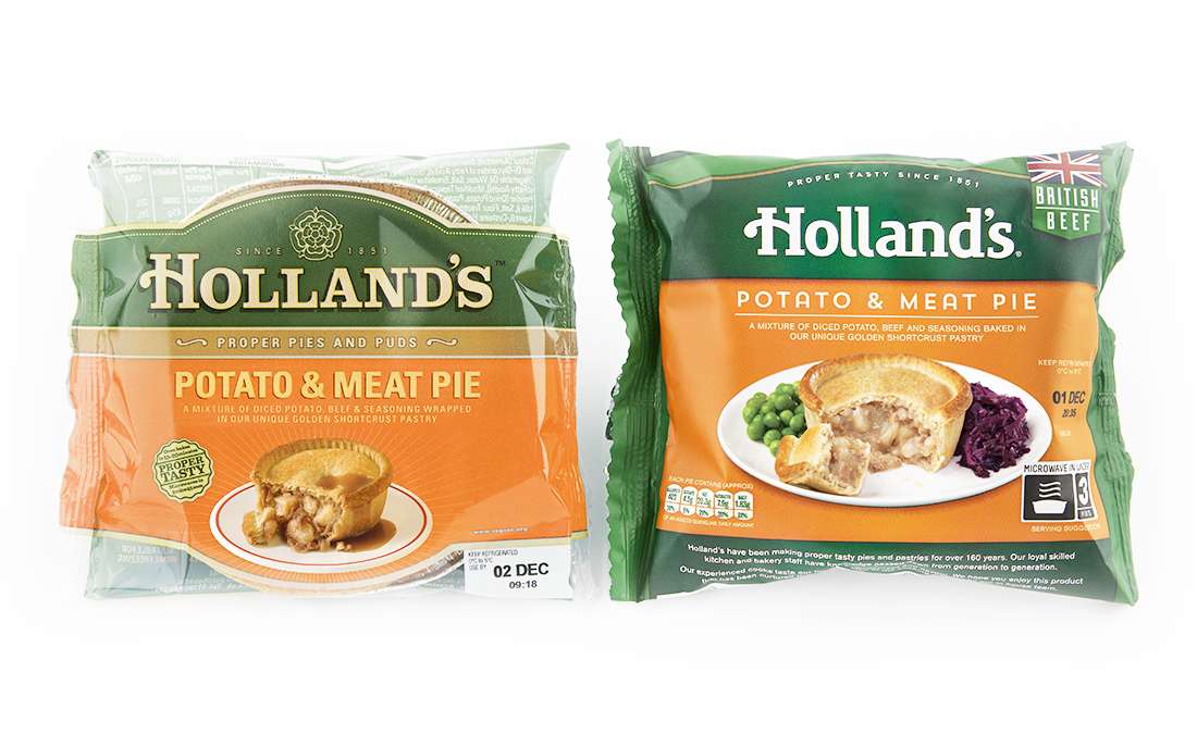
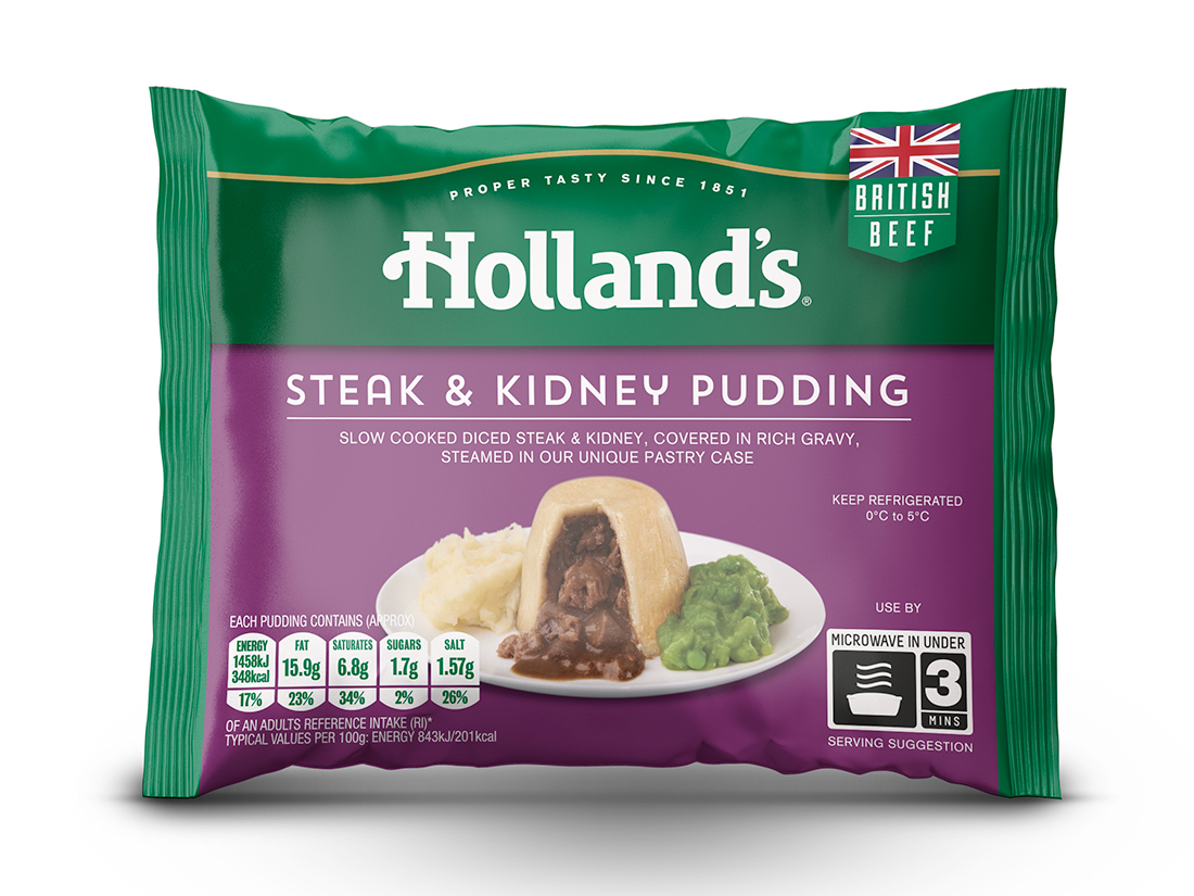
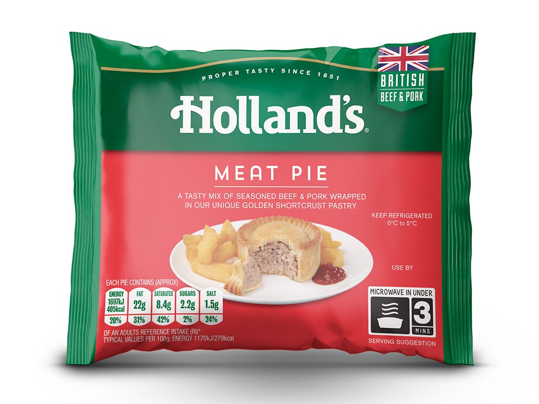
Research showed the Lancashire rose symbol had little recognition out of region this was removed to help simplify the design.
With possible brand extension on the horizon the tag line of “Proper Tasty Pies and Puds” was reworked to “Proper tasty since 1851” combining two elements on the current logo and allowing the word mark to sit within different food groups in the future.
The introduction of the Union Jack was an important on pack feature to communicate the British ingredients and provenance along with new photography to help engage consumers with appetizing serving suggestions.
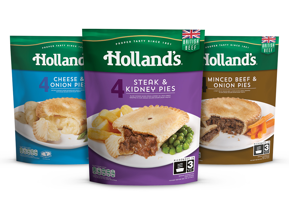
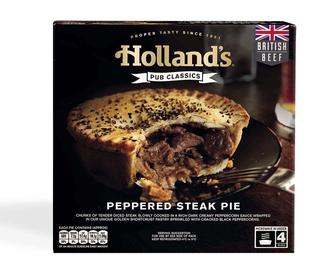
With the Holland’s range rapidly expanding it was important to consider the tiering within the family of products and future launches along with different pack formats. The launch of ‘Pub Classics’ is the first range to sit alongside the original Holland’s offering. Designed with more luxury visual cues and lifestyle photography it reflects the high quality of the ingredients and more premium price point.
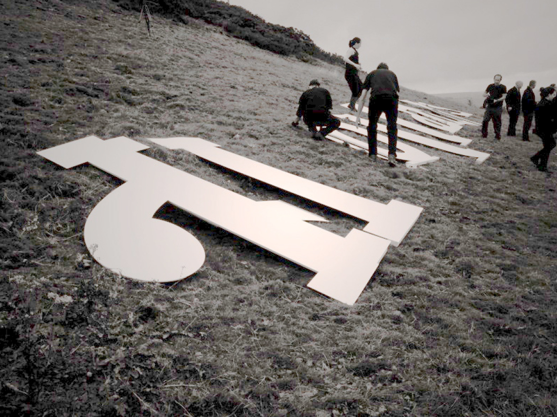
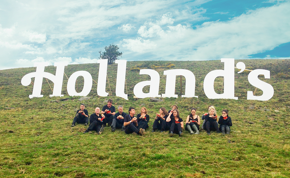
To mark the beginning of the rebrand and launch of the new logo we produced the new word mark in over 50ft wide plastic replicating our very own mini Hollywood hill sign.